Making Your Website Accessible for the Visually Impaired
 by
by
Web designers work and live by a series of well-accepted best practices: always use responsive design, leave enough white space, keep font and color scheme in line with a client’s branding. There are certain niche practices, however, when what you think you know about best practices might be entirely wrong. This may apply when referring to accessibility and effective web design for the visually impaired.
It’s possible that previous to reading this, you may not have considered this demographic. However, making the web experience accessible for everyone is an important part in not only spreading your message, but making the world a better place to live for people who struggle with some sort of impairment.
Visual impairment is also more common than you might think. An estimated 4.5% of the population experiences color blindness, 4% struggles with low vision, and 0.6% is legally blind. Visual difficulties are common enough that they’re worth considering when undertaking a web design.
An author for Smashing Magazine estimated that about 10% of all online customers would benefit from designs that are easier to see. Considering that visual impairments may affect us all as we get older, this seems like a fair assumption.
The Most Common Types of Visual Impairments
When designing for the visually impaired, it’s important to address the most common types of impairments. These include:
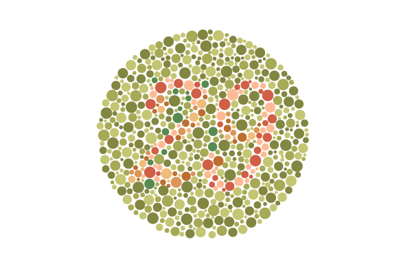
- Color-blindness. The most common type of visual impairment, this affects a person’s ability to distinguish colors. A person who is color-blind may also experience sensitivity to color brightness.
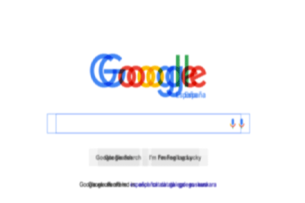
- Low vision. This involves anyone who struggles with acuity (clearness), tunnel vision, cloudy vision (such as from cataracts), or partial sight in one or both eyes.
- Blindness. A person may be legally blind but still be able to make out colors and forms. It involves a substantial loss of functional vision in both eyes.
Designing For Visual Impairment
First, it’s important to note that people with visual impairment perceive the web differently. Accessing and interpreting features may be markedly different for a person with color blindness, low vision, or legal blindness. In some cases, your website’s design may render your site unusable to a person with a visual impairment.
Next, know that in some instances, you’re required by law to make your websites accessible to all. There are two mandates: Section 508, which applies to the public sector, and WCAG 2.0, which applies to the private sector.
If you’re a government agency, contractor, or subcontractor, you might be responsible for compliance to these rules under section 508. The former is a legal mandate, the latter is not. However, adhering to the WCAG ensures that your users have equal access to your website.
Color Contrast
One of the most important, and perhaps easiest, recommendations under the WCAG is appropriate color contrast. According to the WCAG, there are three different conformance levels with regard to color contrast:
- A: minimal
- AA: mid-range
- AAA: highest
Most web designers interested in accessibility shoot for the AA designation, as it appeals to most people. The AA standard is a 4.5-to-1 ratio between the foreground (images and text) and the background. Check out an example of a 4.5:1 ratio for reference.
Adjusting your color contrast is a simple way to improve ease of use for the visually impaired. For those who require more contrast, consider adding a feature in your settings where you can increase your color contrast further (Twitter recently did this in an update).
Be Mindful of Media
Video content poses unique opportunities and challenges with regard to accessibility. On the one hand, audiovisual content can make a website more accessible for someone with visual impairment. On the other, video might make someone with a photosensitivity disorder more likely to experience a seizure. The WCAG has a few guidelines that address media, which include:
- Provide alternatives for media that’s “time-based.” Animated headlines and text might prove too difficult to digest for those with visual processing issues.
- Give all users enough time to read content. In the previous example, you could program the animated headline to stop when your mouse passes over it. This would make the text static and easier to digest.
- Limit flashing Those who are prone to seizures could experience one if they see more than one flash every 3 seconds. When using video, avoid excessive flashing (which is not visually appealing to most).
Try a Monochromatic Color Scheme
Just like it sounds, a monochromatic color scheme relies on different shades of the same hue. This sounds counterintuitive, but it works by removing an extra meaning associated with using multiple color hues.

Variation in tone can work to provide meaning to your website’s elements and attract a user’s attention, just as it would with different colors. As an added bonus, this user attention will span across a wider selection of your audience. BigSound Buzz uses contrast, monochromatic color schemes, and texture for greater accessibility effect.
The Importance of Accessibility in Your User Design
Your website is only as good as its accessibility – that means it’s accessible to any user, anywhere. We often equate accessibility with disability, but a good accessible website reaches every person at any time, under any circumstance. For some people, such as government contractors, accessibility in web design is a legal obligation.
For the rest of us, it’s a moral one. Accessibility is not about disability or impairment; it’s about people. Designers must embrace this concept to make the web a better experience for everyone. These tips will help you begin your next web design project with accessibility in mind. For more information and further guidance, consult the WCAG 2.0 guidelines.

